Identities
Dys, Fashion Through the Glitch Lens; A Conversation With Ophélie Lepert
By Minoas Chatzopoulos
Ophélie Lepert is graduating from the Image Masters program at IFM. Having first completed a master’s degree in communication at CELSA Sorbonne, with a professional background at NellyRodi, Ophélie developed an acute understanding of the zeitgeist. Informed by a knack for subcultures and cultural problematics, her references and visual world are the result of an in-depth questioning on the current state of image fatigue. In this conversation, we explore her end of masters’ project, dys magazine.

Could you introduce the readers to dys magazine, your end of masters project ?
dys is a fashion magazine, a paper object, and for me, a laboratory of sorts to experiment with the way we approach image construction today and the way in which images can circulate and be deformed. dys is somewhat of a reaction to the cultural flattening, motivated by the algorithms and the fast consumption of visual content. dys comes from dysfunction and is also a prefix to all of the words related to troubles of perception, attention, and all sorts of cognitive disorders. These are topics that I wanted to question through the glitch, which is used here as a method and an editorial strategy, more so than just an aesthetic.
How would you define dys in a few words?
I can give you both a cluster of words and a sentence: Perception- displacement of expectations, formats, and content - friction - experimentation. The sentence that sums dys up the best would be, a fashion and research driven magazine, exploring glitch as a creative and critical tool.
What were your inspirations?
I started looking for my subject while reading Julie Ackermann’s Hyperpop: Pop in the Time of Digital Capitalism. It is through it that I became familiar with the concept of glitch. What interested me in the book was the way hyperpop was presented not only as a music genre, but as a broader logic of excess, saturation, and distortion, where the codes of commercial pop are pushed until they become strange, unstable, almost dysfunctional. I was also intrigued by this idea called accelerationism. It is the concept of pushing capitalism to its most extreme, so as to test its limits and overthrow it. What drew me to these concepts is this idea of not standing outside of the conventions, but rather following their codes and intensifying them so as to push them far enough to reveal their limits and deform them. I tried applying this process to the medium of the fashion magazine, by adding in the glitch phenomenon.
What is the glitch and how did you come to use it as an overarching theme for this issue?
When one begins their research on the glitch, it’s defined as a bug, a breakdown, whatever shows on a broken screen. That’s just the tip of the iceberg though, there is more to the term. Beyond its existence as a bug, it also became both a music and an art genre. The definition that you will find is the disruption of an expected flow. Fashion being as codified as it is, especially when it comes to image composition, I thought that attempting to create friction and surprises of sorts in the visuals was compelling. The idea wasn’t to go against the conventions of fashion, but to rather disrupt the medium from within. In one of the stories for instance, glitches appear through the styling, while for an accessories editorial, iconic accessories are individually staged and suggested through their imprint, making them visible beneath the surface. During my research, I built a corpus of images, which I used to analyse how the glitch could materialise conceptually, visually and formally in a variety of pictures. Through this approach, I found certain logics of disruption, displacement and friction that I was then able to transpose in dys.

« Wrapped Icons » art direction by OPHELIE LEPERT, photography by ORANE AUVRAY, light by BENJAMIN TORRES AUGUERO, set design by MAXIME GRAFF & ROMANE ROCHE, hair by CINDY ROMAIN
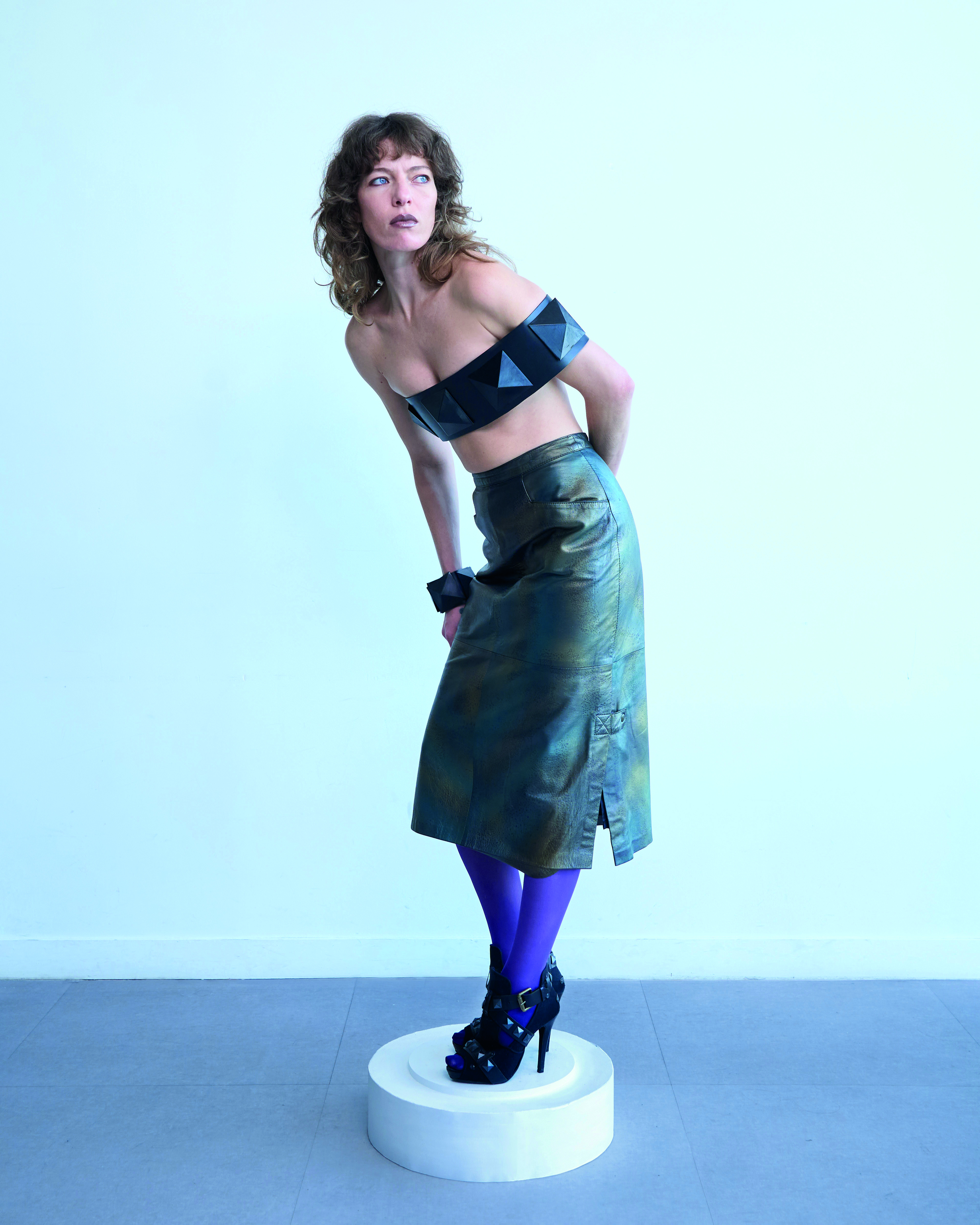
« Out of body » art direction by OPHELIE LEPERT, photography by OLIVIA BRIGHI, lights by EMILIE ZASSO, styling by MARCELINE HEBERT & OPHELIE LEPERT, hair & make up LILJA DIS SMARA, set design by YASMINE MOUTON, modeling by NYIMA CHATELAIN
Are there specific publications that influence your editorial style?
Of course! I am an avid reader of indy press. Novembre magazine for instance, is very good at creating complex and striking imagery, with more depth. In the same way, I love 032c for the more journalistic aspect. All of these independent magazines create really compelling imagery. In Epoch magazine for instance, there was an editorial with pictures modeled after the shape of bas-reliefna, while Carcy did an editorial with a model that was made of translucent glass. Shifting the traditional codes of fashion photography was what I wanted to try and achieve and these magazines greatly inspired me. They show pictures that are narrative driven, eerie, and conceptual without it being at the cost of their visual strength.
Is there ephemera outside of the fashion category that also inspires you?
Yes, I often draw inspiration from theories and concepts in essays and incorporate them into my visual work. I also find good material in posters and graphic design references that are not directly linked to fashion or magazines.
How did your ample industry experience impact your comprehension of the fashion media landscape?
I spent six years working at trend forecasting and marketing strategy agencies. As part of my job and out of personal interest, I was keeping a close eye on fashion and culture, the emergence of what is perceived as weak signals, or identifying how subcultures are becoming more and more mainstream. There is an article from 032C from 2018 that struck me. It is called The Big Flat Now and it goes over this topic of homogenisation of culture through the social media algorithms. All of these methods of analysis allowed me to bring context to my magazine: learning how to decipher aesthetics and their codes, sociological currents, narrative territories etc...
You gathered several contributors with a strong identity for dys. What was the research process like? How did you find the thin line between collaboration and staying true to your editorial policy?
Firstly, by defining the editorial policy that I was envisioning, and by having pretty set ideas of what the formats were going to look like. Each one explores different subjects, and glitch is made to adapt to every one of them. Sometimes, it is more conceptual, others more formal. That’s the angle that I selected the contributors from. At times, I needed a strong identity that aligned with my vision for the subprojects. There were also contributors that I really wanted to work with from the get go. @carl.niklas and @weirdkatebutok on instagram. In the same way, other collaborations occurred very organically. Arno Feinstein, my boyfriend and a phd student in neuroscience, wrote a piece on visual memory. Also when I was looking for a casting director, it turned out that a friend of a friend could help me out there. There were also people that I reached out to directly on Instagram because they were a perfect fit for the project.
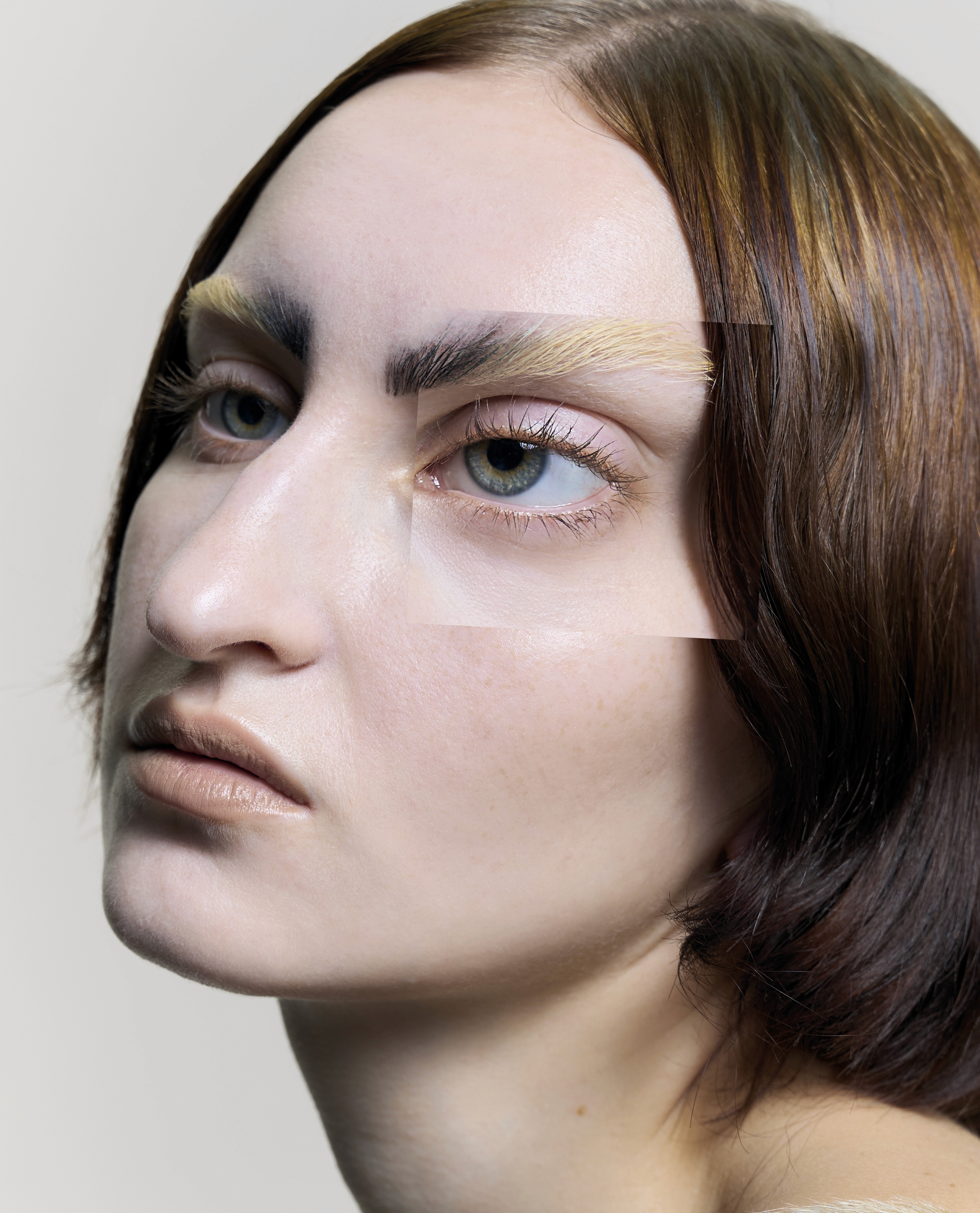
« What is your favorite part » art direction by OPHELIE LEPERT, photography by ZISHU WANG, lights by ARTURO RUIZ, make up by ELOISE MICHEL, retouching by ZISHU WANG & JORDAN HORION, casting and fashion by OPHELIE LEPERT
modeling by EKATERINA LAZAREVA.
How did you approach graphic design for dys?
I was mentored by Marc Armand, a super talented graphic designer. My research allowed me to identify a specific font that I used for the entire issue. Its variety of weights allowed me to create all of the irregularities that I wanted. Rather than relying on a fixed graphic charter, I used a set of flexible graphic principles to create controlled inconsistencies that would trigger the disruption of the immediate readability of the text.
How long did the magazine require to make?
Given the academic context , the deadlines determined the time window. I spent, I would say, one month, finding my subject, researching and understanding what glitch means, and finding ways to incorporate it into the different sections of the magazine. Then the production of it along with its post production and formalisation took around 4 to 5 months, to adapt to both paper and digital formats.
What was your favorite part of the process?
The processes that allowed me to have an optimal view of the project. The research phase and also the post production where the issue started coming together were hard, but very satisfying!
Speaking of which, do you find that dys makes more sense in print form? Are you also working on transcribing the printed matter to digital form?
I wanted to elaborate a hybrid reflection on the magazine as a medium. Print just made more sense as the main format. It’s the best way to go against this logic of rapid consumption, which is linked to the digital format, and create a more controlled and immersive reading experience. Digital does however, matter nowadays. It is intrinsically linked to the topics I tackle in dys. My digital strategy is itself, inspired by the constraints of social media and I came up with formats of these typologies that conceptualize these constraints. Whether it be images that take longer to load or blurry thumbnails, I’m using these formats to bring in the element of friction and slow the user down.
What do you envision as the ideal setting to read dys (sound, place, time of day, sensorial dimension) ?
I see a relaxed state of being, with no specific place, just one where the reader can fully indulge in the contemplation of the paper object in their hands, not this thing of lounging at Bonjour Jacob and flipping through all the magazines in one sitting, I almost see it as that moment as sacrosanct . Regarding sound, something ambient, birds chirping, something continual that’ll immerse the reader. Both day and night work, though I do have a preference for nighttime! The reading itself could be more or less thorough. It's not so much the dedicated time that matters, more so the dedicated attention.I don’t see a drink. I imagine sound and an olfactory element. A drink represents a bit of a distraction and goes against the immersive aspect.
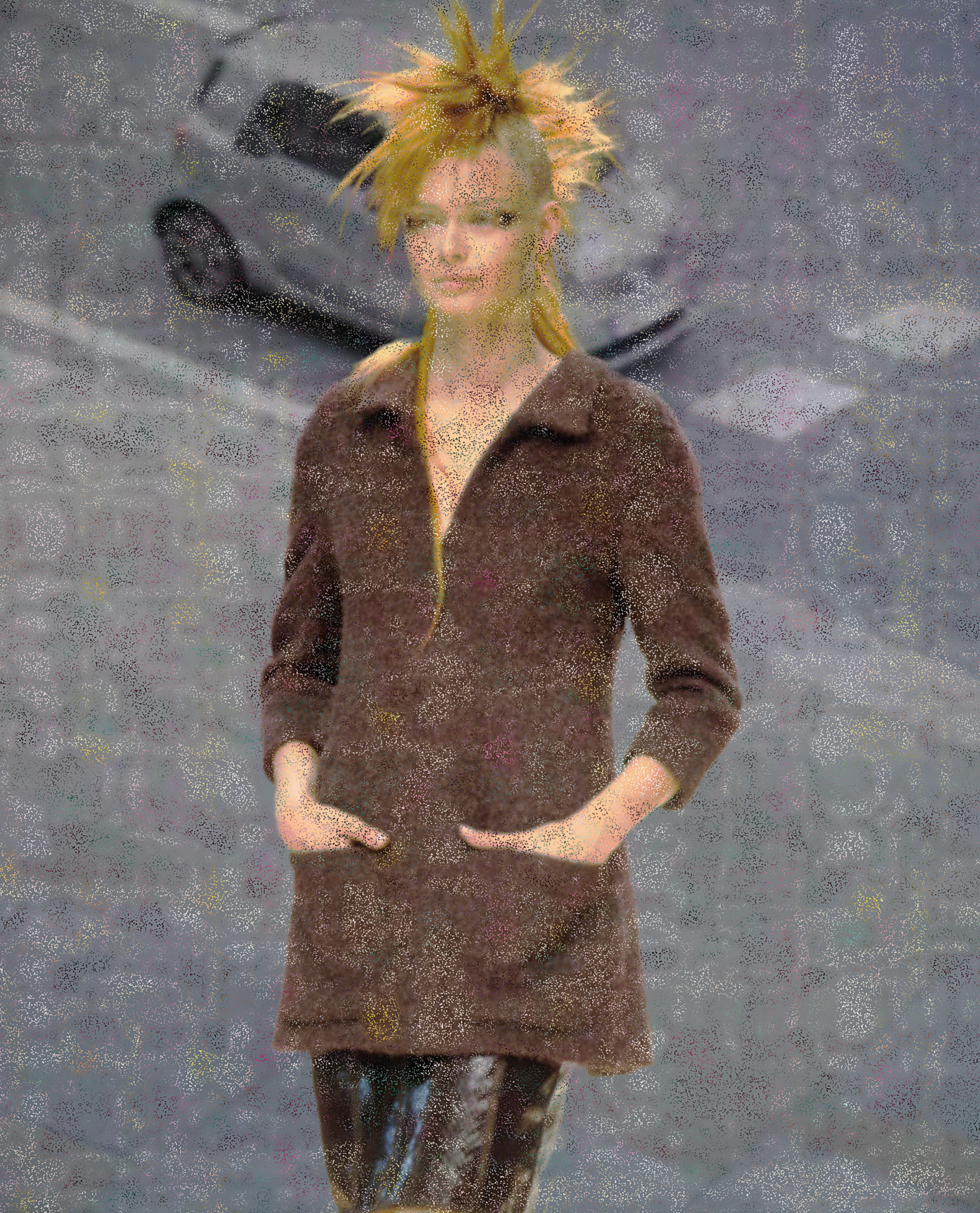
« As time goes by », collages from Chanel Haute Couture fall winter 1999 runway silhouettes, by Ophélie Lepert
What was going through your head few minutes before unveiling the final product at the Alaïa foundation?
Good question, everything and nothing, in a state of brain rot. There was excitement, to finally unveil this project, and to receive feedback from a variety of professionals. I’d also say relief, I was happy that it was done because it was so intense. So I guess, relief, exhaustion and excitement, all of that at once!
Follow @ _dys__ on Instagram to stay updated on the digital content along with the release date!
Doc/34 all rights reserved, sponsored by IFM.
" height="65.65946764590899px" id="biO_icj08" transform="translate(0 1.371)" width="59.174572953517554px"/><path d="M 63.167 33.692 C 63.167 54.377 50.565 68.088 31.544 68.088 C 12.524 68.088 0 54.69 0 33.927 C 0 13.163 12.371 0 31.626 0 C 50.882 0 63.17 13.163 63.17 33.692 Z M 46.89 33.848 C 46.89 21.155 41.097 13.477 31.626 13.477 C 22.155 13.477 16.206 21.234 16.206 33.848 C 16.206 46.463 22.077 54.533 31.626 54.533 C 41.176 54.533 46.89 46.698 46.89 33.848 Z" fill="rgb(0, 0, 0)" height="68.08839784893921px" id="A8_8V8D77" transform="translate(58.705 0.196)" width="63.17042207703656px"/><path d="M 43.755 24.133 C 42.268 17.003 38.119 13.477 31.388 13.477 C 21.838 13.477 16.281 20.998 16.281 33.927 C 16.281 46.855 22.073 54.455 31.779 54.455 C 36.084 54.455 39.763 52.653 42.033 49.519 C 43.363 47.638 43.911 46.071 44.381 42.781 L 60.662 45.209 C 59.175 51.869 57.453 55.709 54.165 59.548 C 49.312 65.111 41.72 68.088 32.249 68.088 C 22.778 68.088 14.637 65.111 9.08 59.47 C 3.287 53.593 0 44.426 0 33.927 C 0 23.427 3.287 14.26 9.471 8.149 C 14.872 2.899 22.778 0 31.935 0 C 42.033 0 49.938 3.448 55.026 10.264 C 57.531 13.477 58.861 16.376 59.879 20.998 Z M 100.346 1.41 L 72.246 77.804 L 58.235 77.804 L 86.414 1.41 Z" fill="rgb(0, 0, 0)" height="77.80411839929134px" id="v1AksvdEb" transform="translate(121.519 0.196)" width="100.34629996240147px"/><path d="M 16.594 46.933 C 17.064 49.519 17.533 50.616 18.786 51.948 C 20.899 54.142 24.03 55.317 27.787 55.317 C 33.892 55.317 37.728 52.261 37.728 47.482 C 37.728 44.269 36.162 41.762 33.501 40.743 C 31.701 40.117 29.274 39.725 26.222 39.725 C 23.169 39.725 19.647 39.881 16.594 40.195 L 16.594 26.718 C 19.255 27.032 21.838 27.188 24.891 27.188 C 32.327 27.188 36.006 24.681 36.006 19.666 C 36.006 15.435 33.031 13.007 27.865 13.007 C 22.308 13.007 19.49 15.2 18.316 20.215 L 1.409 17.786 C 2.896 12.928 4.148 10.578 6.653 7.835 C 11.428 2.664 18.629 0 28.178 0 C 36.71 0 43.755 2.351 48.216 6.66 C 51.112 9.559 52.6 13.32 52.6 17.786 C 52.6 26.091 48.138 31.263 39.137 33.378 C 43.911 34.083 46.494 35.18 49.234 37.531 C 52.521 40.508 54.4 44.583 54.4 49.127 C 54.4 53.123 53.304 56.806 51.269 59.548 C 49.547 61.899 46.807 64.092 43.911 65.424 C 39.841 67.305 33.501 68.48 27.63 68.48 C 20.586 68.48 13.541 66.835 9.393 64.092 C 5.792 61.742 3.053 58.294 1.331 53.985 C 0.861 52.888 0.548 51.869 0 49.832 Z" fill="rgb(19, 136, 8)" height="68.48016075605614px" id="UrmKxPWFQ" transform="translate(219.752 0)" width="54.399905030019454px"/><path d="M 0 37.844 C 2.348 35.233 4.853 32.36 7.514 29.226 L 24.5 9.324 C 28.257 5.015 29.744 3.056 31.779 0 L 47.825 0 C 47.355 4.623 47.199 7.757 47.199 13.007 L 47.199 38.471 L 49.469 38.471 C 51.895 38.471 54.478 38.236 57.218 37.844 L 57.218 52.104 C 54.87 51.791 51.973 51.634 49.547 51.634 L 47.199 51.634 L 47.199 55.552 C 47.199 59.94 47.355 62.212 47.825 65.189 L 31.701 65.189 C 32.092 62.525 32.327 59.235 32.327 55.395 L 32.327 51.556 L 10.176 51.556 C 5.088 51.556 2.896 51.634 0 51.869 Z M 32.405 29.539 C 32.405 26.013 32.562 21.704 32.875 18.256 C 31.309 20.45 30.135 22.017 28.022 24.681 L 16.594 38.628 L 32.405 38.628 Z" fill="rgb(19, 136, 8)" height="65.18935212489366px" id="nz3MAn0g5" transform="translate(272.782 1.567)" width="57.21774185674667px"/></g></svg>)